When it comes to designing a bedroom, most people focus on making it stylish or Instagram-worthy. But few realize that the colors you choose can have a big impact on your mood, sleep quality, and even stress levels. The wrong color palette—especially in the one place meant for rest—might actually be making you feel more anxious without you realizing it.
Let’s take a closer look at which colors could be working against you, and what to consider instead if you want your bedroom to truly feel like a calm, peaceful retreat.
Red: Powerful but Overstimulating
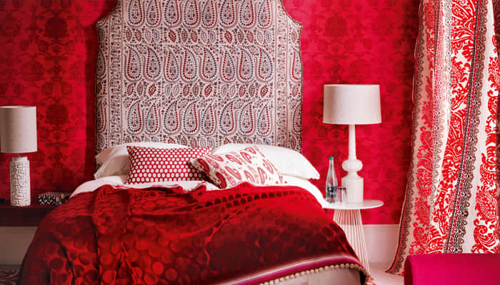
Red is a bold, dramatic color that demands attention. In branding and fashion, it symbolizes energy, love, and strength. But in a bedroom, red can be too intense. Bright or deep red tones can stimulate the nervous system, raise heart rate, and even make you feel more alert—great for a gym, but the opposite of what you want when winding down.
Some people love adding red for passion or warmth, but in large amounts—like on walls, bedding, or curtains—it can create a sense of urgency or even restlessness. If you love red, try using it only in small accents, like a throw pillow or a piece of artwork, instead of making it the main theme.
Black and Dark Grey: Chic but Emotionally Heavy
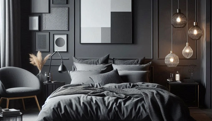
A deep black or charcoal bedroom might seem luxurious or modern, but these dark shades can feel oppressive in small or dimly lit rooms. When used too heavily, black can absorb light and make a space feel closed in, which may lead to feelings of heaviness, fatigue, or sadness.
While some people find dark colors cozy, others find them mentally draining—especially if you’re already prone to anxiety or overthinking. If you want a moody or sophisticated vibe, try balancing darker shades with soft lighting and lighter accessories to keep the space from feeling too somber.
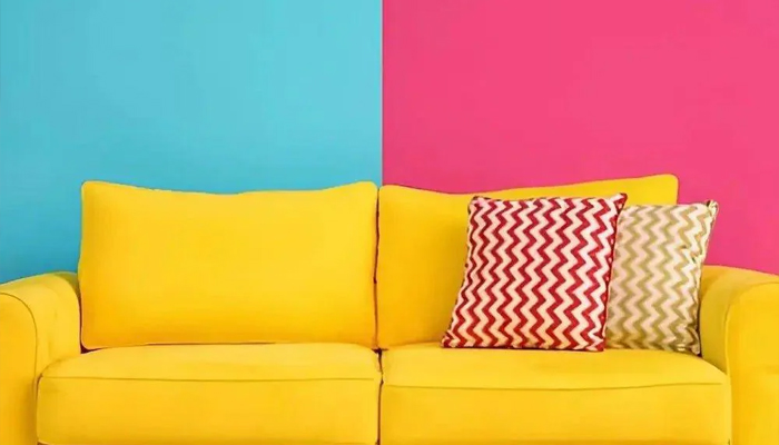
Bright Yellow: Happy but Too Loud
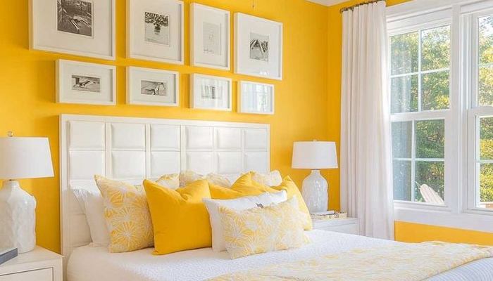
Yellow is often linked with happiness and energy, which sounds great—until you realize your brain might interpret too much yellow as overly stimulating, especially in its brightest shades. In a bedroom, this can translate to trouble relaxing, difficulty falling asleep, or waking up feeling wired instead of rested.
Pale or muted yellows can be cheerful in small amounts, but neon or sunshine yellow walls can make the room feel more like a busy café than a restful space. If you like yellow, go for soft buttery tones, and pair them with natural materials to ground the look.
Pure White: Clean but Cold
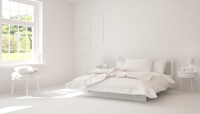
White is a go-to for bedrooms because it feels clean and fresh—but not all whites are created equal. Stark, pure white can actually feel sterile, like a hospital room, especially if it’s paired with lots of sharp edges or harsh lighting.
This kind of white can feel cold and emotionally distant, which may not be ideal if you’re craving a restful, safe-feeling environment. A better choice? Off-whites, creams, or soft warm whites that still look clean but have a bit more warmth and softness to them.
Bright Orange: Fun but Too Energetic
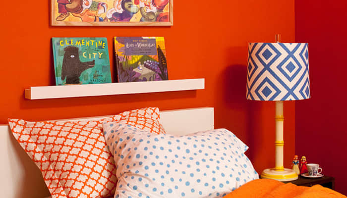
Orange is cheerful, energetic, and associated with creativity—but much like red and yellow, it can be too intense for a bedroom. Bright orange walls or bedding might make the room feel lively, but they also tend to keep your brain in a more active state, which can make it harder to wind down at night.
If you’re drawn to orange, try using terracotta or burnt orange in small touches. These earthier versions still give warmth but feel more grounded and restful.
Highly Saturated Colors: Overstimulating to the Brain
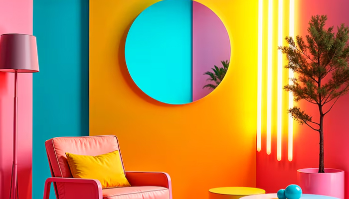
Whether it’s hot pink, electric blue, or lime green, ultra-bright and saturated colors tend to stimulate the eyes and brain. These shades are often used in kids’ playrooms or gyms because they spark activity and attention—but that’s exactly what you don’t want when you’re trying to rest.
These colors can also clash with natural light, especially in the morning, making it harder to ease into your day. If you like bold colors, use them as small pops (like a rug, a print, or a vase), and keep the overall palette more subdued.
Better Alternatives: Calming Colors That Work with You
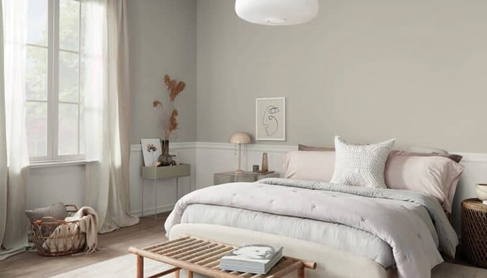
So, what colors do help create a peaceful space?
- Soft blues mimic the sky and sea, creating a sense of openness and calm.
- Muted greens remind the brain of nature, promoting balance and serenity.
- Lavender or dusty purple brings a hint of luxury while keeping the space soft and peaceful.
- Warm neutrals like beige, taupe, or clay can add warmth without overwhelming your senses.
The key is choosing tones that are muted, low in contrast, and easy on the eyes. Think natural, earthy, or washed-out colors that make the space feel gentle and grounding.
It’s Not Just About Walls
Even if your walls are a calming color, other elements can throw off the room’s vibe. Bedding, curtains, furniture, and even artwork can all affect how you feel in the space. If your bedroom still feels “off” despite soft wall colors, take a look around—are your sheets a harsh color? Is the lighting too blue or too cold?
Consider layering in soft textures, warm light, and natural materials like wood, cotton, or linen. These can all work with your color palette to create a space that truly supports rest and relaxation.